Digital library interfaces: a comparative look
Screenshots and notes from the live interfaces of 17 organizations — national libraries, archives, aggregators, and research repositories — alongside HSDL's current surfaces. The goal is a shared, concrete picture of where our experience sits relative to the field. A working reference, not a scorecard.
22 interface captures · observed July 22, 2026 · desktop, live web, comparable topical searches ("critical infrastructure", "civil defense", "public health") · internal
Where HSDL is today
The four surfaces a researcher moves through, in order — with what each does and where it's honestly thin. Click a screenshot for full size; links open the live pages.
HSDL Home — Mission-led discovery portal
What it does: Pairs a direct search entry with topical prompts, curated Featured Resources, and recognizable domain imagery.
Honest gap: Several entry points (search, tips, Featured Resources, topics) compete for the first glance.
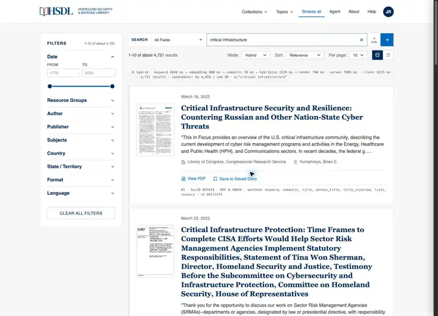
HSDL Search — Hybrid, fielded, faceted search
What it does: Combines field selection, Boolean-style conditions, semantic modes, deep facets, layouts, and direct PDF actions.
Honest gap: Long government-document titles and several simultaneous controls create a dense first scan.
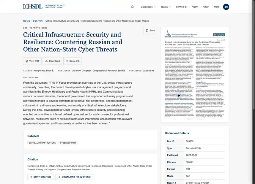
HSDL Document — Policy-document detail and citation view
What it does: Balances a readable description, document preview, provenance, subjects, save, download, copy-link, citation, RIS export, and related records.
Honest gap: The detail page is excellent for understanding one record, but sustained side-by-side reading still belongs in the workspace.
HSDL Agent — Three-column research workspace
What it does: Keeps conversation history, the active inquiry, and an evidence carrel in one persistent workspace.
Honest gap: The value shown here builds over a session; a first-time user starts from empty rails, which need strong guidance.
How that compares, dimension by dimension
Position is a plain read of the captures — where we match the field's norm, where we're ahead, and where we're not.
Dimension Field norm HSDL, as observed Position
Entry & orientation Search plus curated collections or editorial modules Mission-led home, search tips, Featured Resources, topics Solid Expert retrieval Facets, field choice, sort, layout, saved/export actions Fielded conditions, Hybrid/Keyword/Related modes, deep facets, PDF + save actions Solid Record understanding Metadata, preview or viewer, download, citation, related items Preview, provenance, subjects, save, PDF, copy link, citation, RIS, related records Solid Visual object inspection Zoom, rotate, fullscreen, image adjustment, transcription Document preview and detail; fewer media controls than NYPL or the National Archives Limited — acceptable for policy PDFs Research continuity Fragmented across save lists, galleries, email, export, or annotation Persistent Agent conversation, history, sources, and research carrel Ahead of the field Degraded-state handling Mixed; many systems show banners, gates, or friction Not exercised in the refreshed captures — how HSDL presents a search outage remains untested here Untested
The field, grouped by interface pattern
Every capture, visible on the page — click a screenshot to view it full-size (arrows page through the group); the link beneath each opens the live site. Grouped by the primary pattern each interface represents.
Simple discovery (5)
One search box, minimal controls — approachable entry points that lean on curation or imagery.
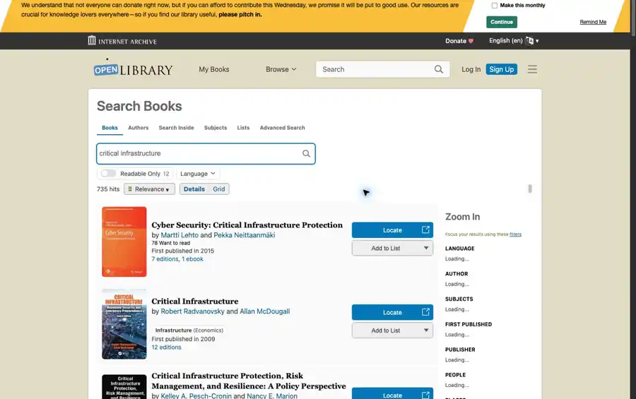
Open Library — Book-first public catalog
Works well: Immediate book covers, availability, editions, and list actions make the result intent obvious.
Tradeoff: Bibliographic density and repeated actions compete for attention once the list grows.
Relevance to us: Borrow its instantly legible result anatomy, but keep HSDL’s policy metadata and domain-specific signals.
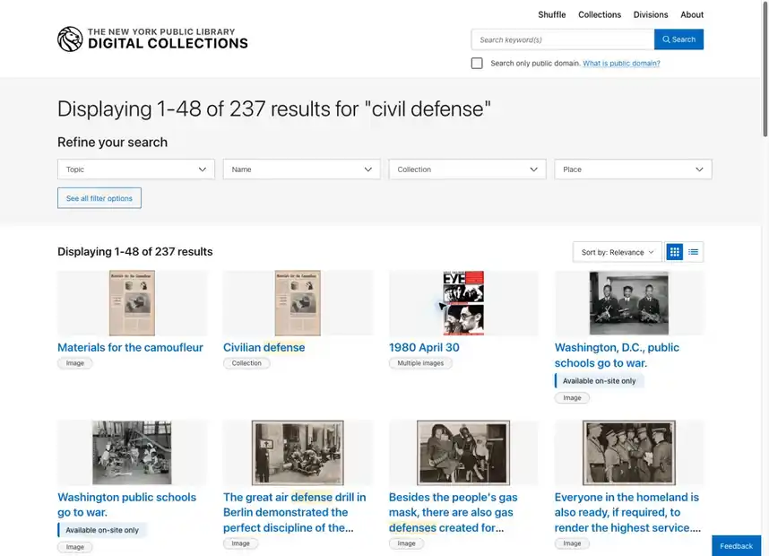
NYPL Collections — Image-led special-collections search
Works well: Large thumbnails, restrained filters, public-domain scope, and clear collection/item labeling make browsing effortless.
Tradeoff: The pattern is optimized for visual objects and would under-express long policy documents.
Relevance to us: Use this as the benchmark for topical and collection browse surfaces, not for the primary report list.
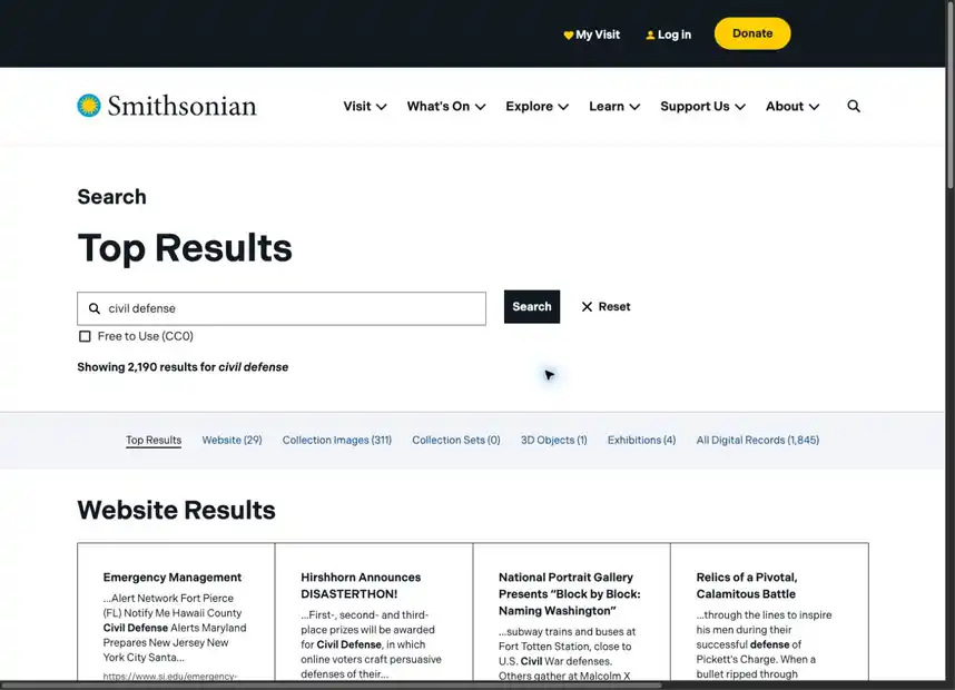
Smithsonian — Cross-domain institutional search
Works well: One query crosses websites, collection images, collection sets, 3D objects, exhibitions, and all digital records.
Tradeoff: Category breadth can obscure whether the user is searching scholarship, exhibits, or objects.
Relevance to us: HSDL’s narrower corpus should make intent modes explicit rather than multiply top-level categories.
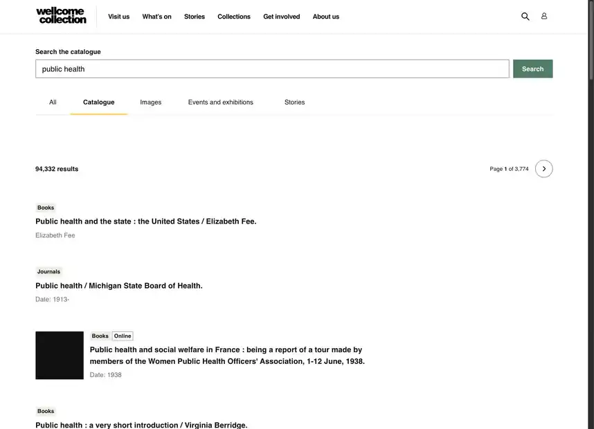
Wellcome Collection — Editorial catalogue search
Works well: Exceptional restraint, typography, and a small set of understandable filters keep attention on the works.
Tradeoff: Low visual density means fewer comparative signals fit above the fold.
Relevance to us: A valuable counterweight for HSDL: advanced capability can still arrive through calm visual hierarchy.
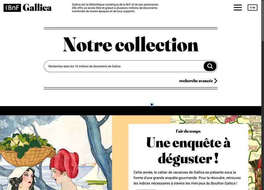
Gallica — Curated national-library portal
Works well: A strong editorial identity combines a ten-million-object search with exhibitions, thematic paths, and publication stories.
Tradeoff: The search URL used in this review redirected to the French portal, making the query-to-result path less predictable.
Relevance to us: HSDL’s In Focus material can become a genuine editorial layer without displacing research search.
Faceted & advanced search (10)
The advanced-library norm: facets, field choice, sorting, layouts, export. This is the crowded middle of the field.
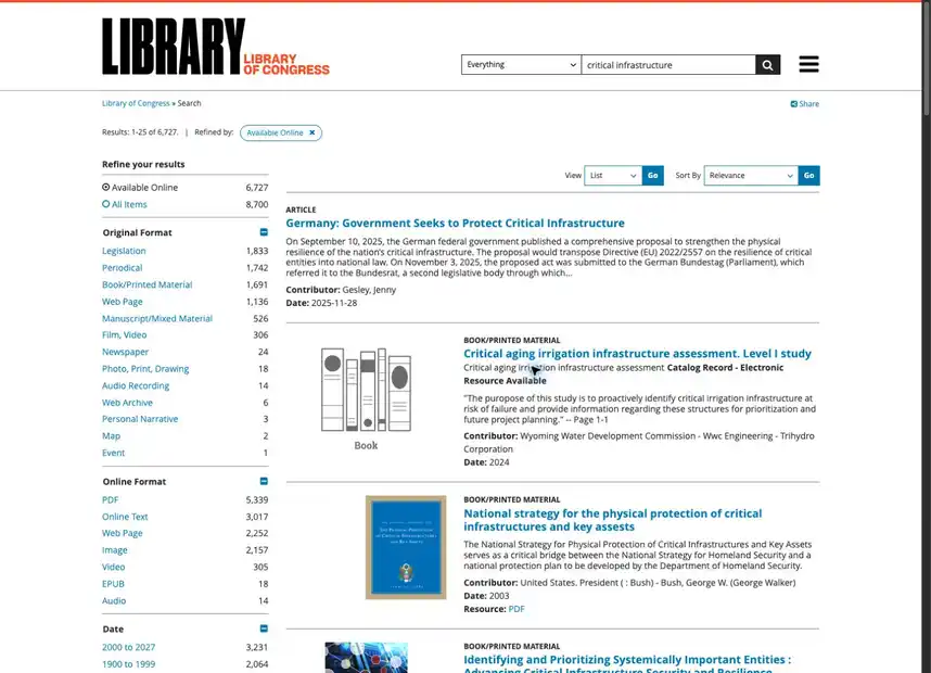
Library of Congress — Universal collection search
Works well: Format-aware facets, multiple result layouts, authoritative descriptions, and direct resource links support broad discovery.
Tradeoff: A dense sidebar and legacy list styling increase cognitive cost; access also required human verification in this review.
Relevance to us: HSDL can be materially more approachable without surrendering field, format, or provenance precision.
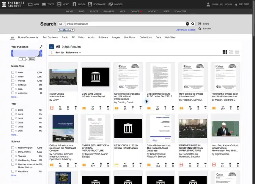
Internet Archive — Mass-scale multimedia archive
Works well: Media tabs, date histogram, deep filters, and grid browsing make an enormous heterogeneous corpus navigable.
Tradeoff: Global navigation, tab taxonomy, filter rails, and object cards compete in the same viewport.
Relevance to us: HSDL should preserve its narrower domain vocabulary; corpus focus is a UX advantage, not a limitation.
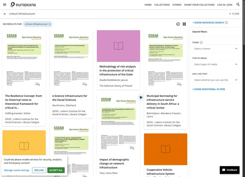
Europeana Search — Visual cultural-heritage aggregator
Works well: A visual grid, rights cues, item selection, likes, and galleries make discovery feel collectible.
Tradeoff: Sparse records and varied provider quality make comparison uneven across results.
Relevance to us: Saved research sets should feel as tangible as Europeana galleries while retaining HSDL’s evidence discipline.
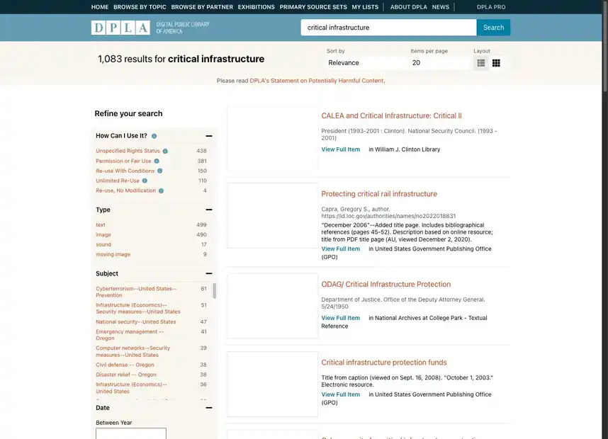
DPLA — Classic faceted heritage search
Works well: Rights, type, subject, place, institution, and partner facets are clearly separated from the result list.
Tradeoff: The hierarchy is practical but visually conservative and leaves little support for cross-item synthesis.
Relevance to us: HSDL can match the filter clarity and exceed the workflow model.
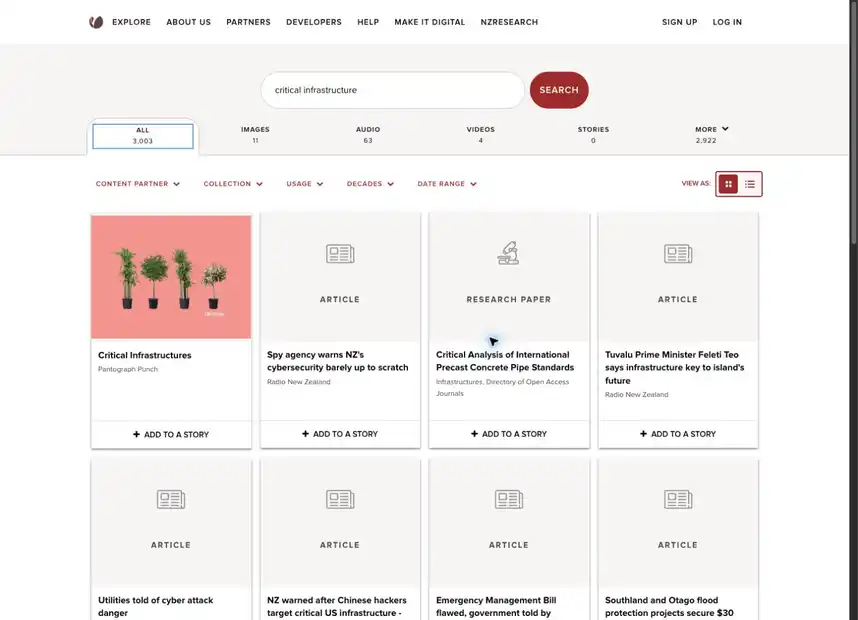
DigitalNZ — Visual national aggregator
Works well: Media-type tabs, partner filters, grid/list switching, and story-building support exploratory collection making.
Tradeoff: Mixed media and partner sources make relevance and result comparability harder to scan.
Relevance to us: The story metaphor is useful precedent for HSDL briefs and research collections.
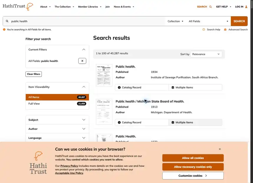
HathiTrust — Scholarly corpus catalogue
Works well: Viewability, subject, author, language, place, date, and original-format facets serve serious corpus work.
Tradeoff: Institutional navigation and a cookie banner add weight before the user reaches the results.
Relevance to us: HSDL’s authenticated environment should feel lighter while preserving access-state clarity.
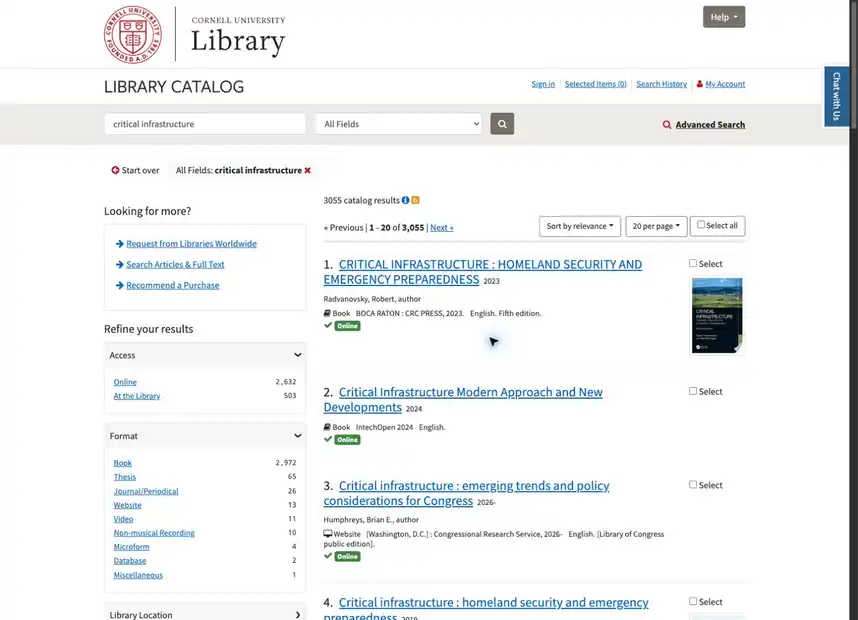
Cornell Catalog — Academic Blacklight catalog
Works well: Search constraints, deep catalog facets, record selection, and adjacent discovery links support expert retrieval.
Tradeoff: The interface exposes many library-system boundaries and retains a conventional catalog aesthetic.
Relevance to us: HSDL already compares well visually; it should retain power-user semantics without inheriting system fragmentation.
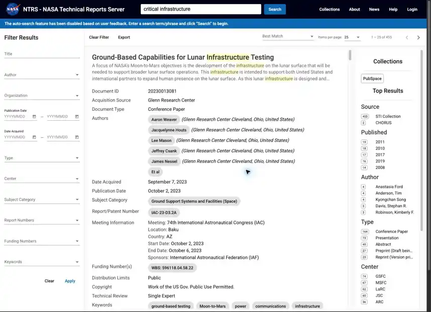
NASA NTRS — Technical-report repository
Works well: Parallel filters, collection labels, source metadata, subject chips, and date control support technical precision.
Tradeoff: The three-column density requires expertise and leaves little room for explanatory guidance.
Relevance to us: A close government-research analogue: HSDL can win through better progressive disclosure and research continuity.
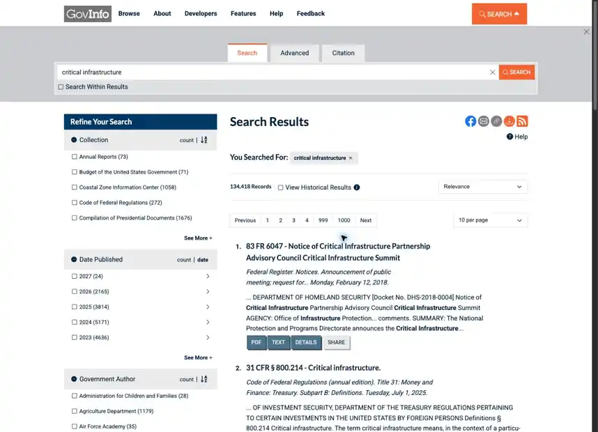
GovInfo — Government publication search
Works well: Package formats, download options, historical results, citation-style search, and refiners support official-document work.
Tradeoff: Utility controls and dense metadata compete with the result titles.
Relevance to us: HSDL should match format and citation utility while keeping its calmer document cards.
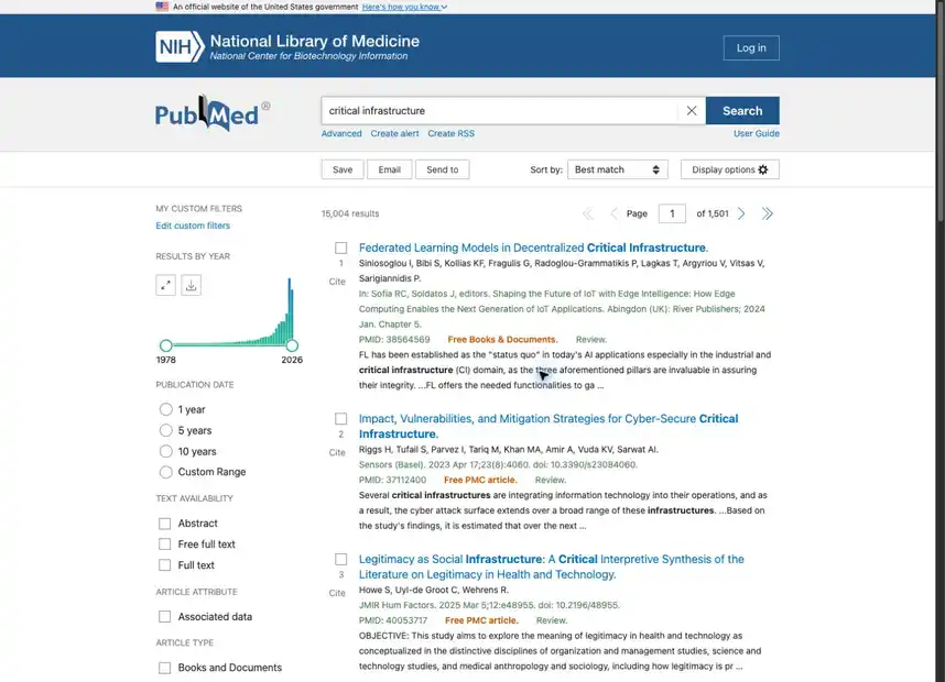
PubMed — Precision research database
Works well: Results-by-year, granular filters, saved searches, export, email, display modes, and precise citation metadata serve expert workflows.
Tradeoff: The interface assumes domain literacy and emphasizes retrieval mechanics over orientation.
Relevance to us: The benchmark for serious research actions; HSDL’s advantage is joining comparable rigor to human-readable guidance and an agent.
Item & object viewers (3)
What a single record looks like once opened — metadata, media controls, provenance, related material.
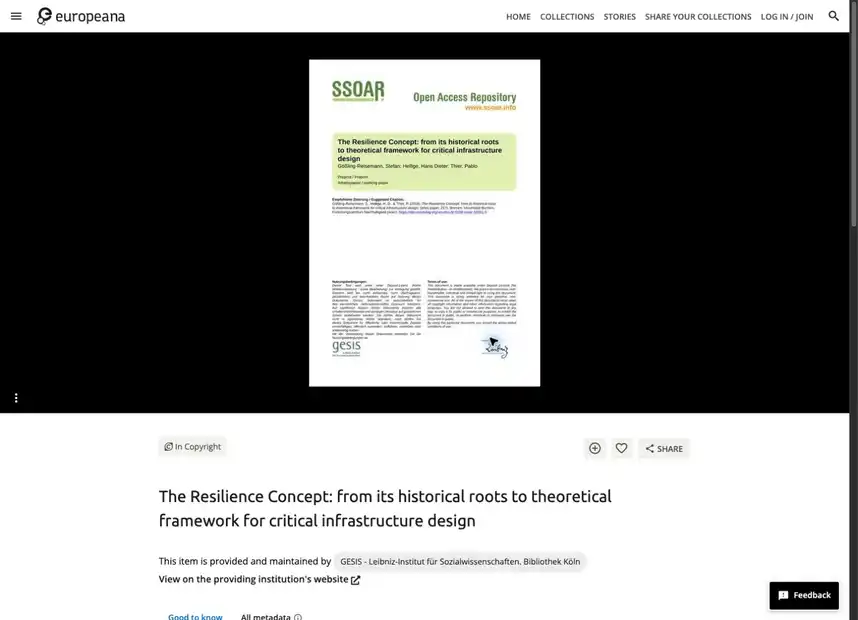
Europeana Item — Aggregated item and provenance view
Works well: Rights, provider, language, metadata, related collections, and the source institution remain visible around the object.
Tradeoff: The user still leaves the item to perform sustained analysis or comparison.
Relevance to us: HSDL’s opportunity is to keep provenance this legible while carrying the item directly into an active investigation.
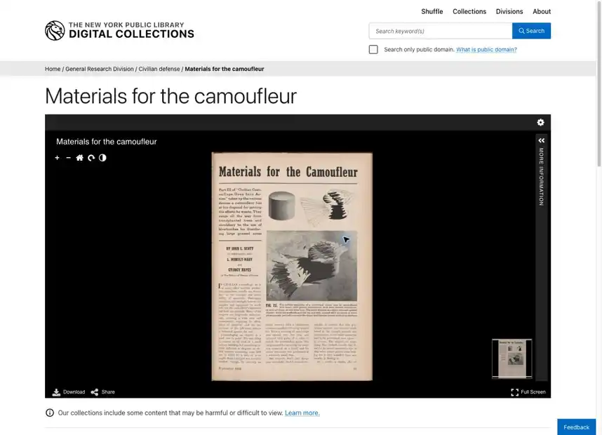
NYPL Viewer — Digital-object media viewer
Works well: Zoom, rotation, image adjustment, fullscreen, download, sharing, citation, and item data surround the object without hiding it.
Tradeoff: Excellent inspection still stops short of a comparative research workspace.
Relevance to us: HSDL’s document viewer should aspire to this control clarity while connecting annotations and sources to the research carrel.
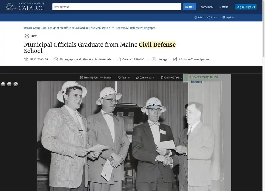
National Archives — Archival record and hierarchy viewer
Works well: The media viewer sits alongside provenance, record group, series, creator, transcription, tags, comments, and downloads.
Tradeoff: Archival hierarchy and participation tools produce a very long, information-dense record.
Relevance to us: This is the strongest precedent for keeping provenance and community interpretation attached to evidence.
Method & honest caveats
These are direct desktop observations of live interfaces in one research session — comparative evidence for product direction, not a usability, accessibility, mobile, or performance audit.
The Library of Congress required completing its human-verification step before capture.
Gallica redirected to its French portal; HathiTrust kept its live cookie banner in frame.
The original HSDL home capture was of an outdated build showing a search-unavailable banner (most likely the capture tool's own connectivity, not a live outage); it was retaken from the current live home on July 22. Degraded-state design is marked untested in the table above.
Princeton, WorldCat, Stanford, Michigan, and JSTOR did not yield reliable captures and are not counted.
HSDL internal · digital-library interface landscape · captures observed July 22, 2026